
Understanding your analytics dashboard
On this page
Your analytics dashboard turns everything happening in your inbox into a few plain-language numbers: how much of your support the AI is handling, how fast conversations close, when your customers write in, and which channels they use. It's built for a quick daily glance, not a spreadsheet.
Open it from Analytics in the left sidebar. There are two pages: Overview (the big-picture story) and Channels (a breakdown by where messages came from).
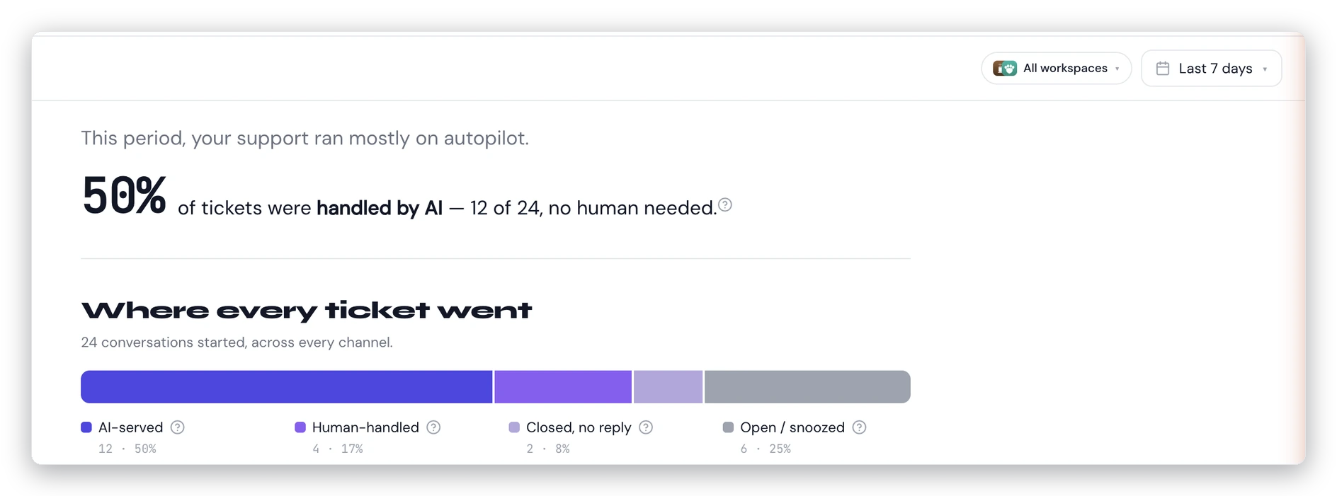
The Overview page: your AI-handled rate up top, and a single bar showing where every conversation went.
Choose what you're looking at
Two controls at the top of every analytics page decide what the numbers cover:
- Workspace scope. If you run more than one workspace, pick one, several, or all of them. Choose two or more and a comparison panel appears so you can see them side by side.
- Date range. Last 7, 30, or 90 days, or a custom range. Dates are read in your own timezone, so "today" means your today.
Your choices stick as you move between the Overview and Channels pages.
The headline: your AI-handled rate
At the top of the Overview page is a single number — the share of conversations the AI handled with no human needed. It reads like a sentence: "68% of tickets were handled by AI — 34 of 50, no human needed."
This counts conversations the AI resolved on its own plus ones where the customer found their answer in a suggested help article. It deliberately leaves out API traffic so the rate reflects the real, human-facing channels — email, your contact form, and chat.
Where every ticket went
Below the headline, a single stacked bar breaks every conversation into four outcomes: AI resolved, self-served, needed a human, and still open. Hover any segment for a tooltip explaining it. For exactly how a conversation lands in each bucket, see AI resolved, self-served, needs a human: how conversations are counted.
How fast you're closing
Two line charts track your median resolution time over the window — one for conversations the AI resolved, one for those a teammate resolved. Comparing the two tells you where your time actually goes.
When your customers write in
A day-by-hour heatmap shows when new conversations arrive (in your timezone), so you can see your real busy periods and staff around them.
The Channels page
The Overview keeps things clean by focusing on human-facing channels. The Channels page is where you dig into volume: total conversations by channel, a trend line over time, and a per-channel outcome split — including API traffic, which the Overview leaves out. See Reading the Channels report for more.
A few things to know
- New workspace? If there's nothing to show for the range you picked, you'll see "No data for this range yet." Widen the range or come back once conversations have come in.
- AI turned off? A banner reminds you, since it affects what the numbers can tell you.
- Analytics is available to everyone on your team, on every plan.